Creative Property
Dowling Real Estate Elermore Vale, Wallsend and Stockton Franchises briefed Engineroom on rebranding their agencies to Creative Property transitioning them away from the Dowling Brand.
They wanted an identity that would stand out and be different to their competitors in the local market. We researched other real estate agencies in the area and developed an identity, vision and visual positioning for Creative Property which was relatively timeless, had a contemporary edge and was iconic enough to create an impactful brand presence.
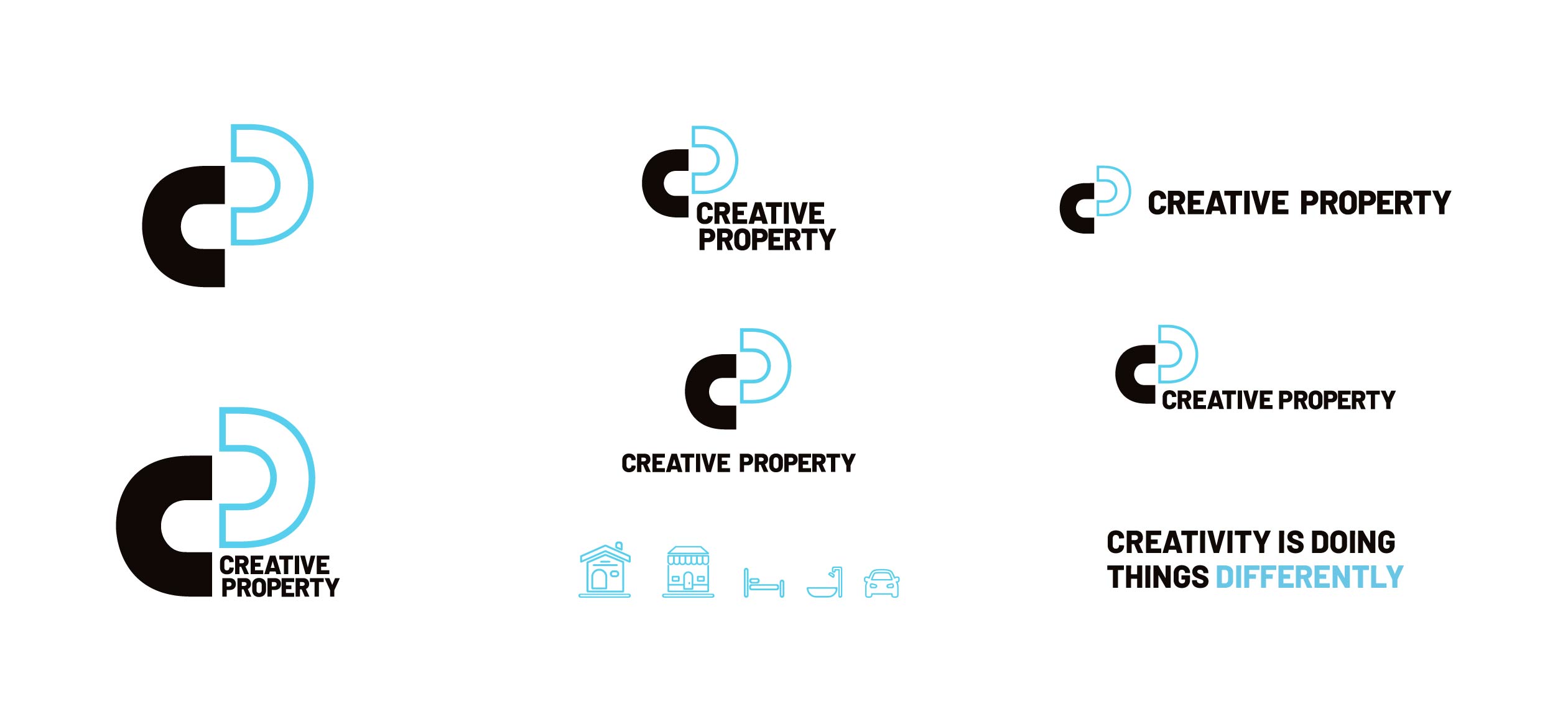
The logo device we developed of the C and the P portrayed two people coming together - the agent and the vendor, the agent and the buyer, the agent and the landlord or the agency and tenant. The logo also had strength to stand alone without the visual support of the wording Creative Property as an iconic device.
The young and fresh colour palette reinforced the office locations. The green representing Wallsend and Elermore Vale offices by the bush and the blue shades depicting Stockton by the ocean.
Deliverables
– <ahref="https://engineroomdesign.com.au/branding/visual-identity/">New Brand Development
– Brand Rollout
– Brand Guidleines
– Logo Design
– Brand Application and Templates
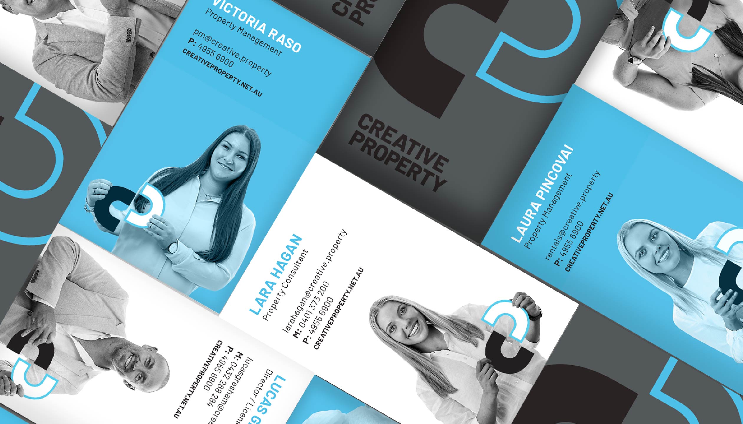
– Print Collateral
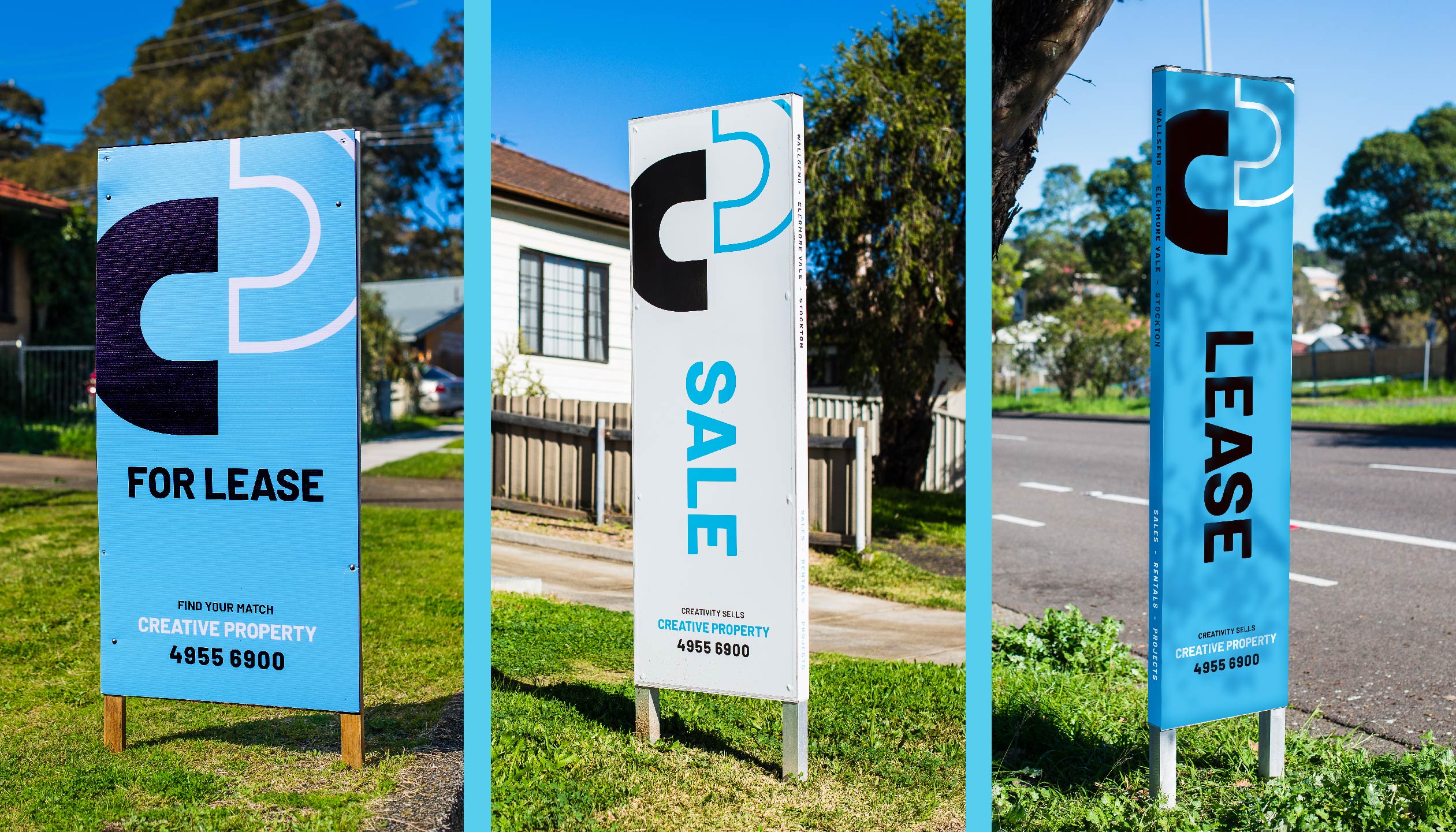
– Signage


